When I was first approached by the ladies from #StandForLIFE, I was admittedly a bit hesitant to take on a new job in the midst of a busy work season. Yet I quickly became endeared to the team - partly because they nicknamed me the “design ninja” and also because I felt they truly appreciated the value of what I could bring to the table design wise. I was inspired by their mission and values and through the process of working with this team, my eyes were opened - both personally and professionally.
#StandForLIFE began as a social media movement and gained momentum quickly. Their branding mainly consisted of Instagram photos combined with the LIFE filter they created, along with their logo. When the team approached me, I had the opportunity to help shape and widen the visual direction of their brand, which was so exciting. What’s unique about this nonprofit is that it was started by a team of female photographers who felt called to respond after the secretive Planned Parenthood videos went live in 2015. They wanted to respond in a way that honored all parties involved and celebrated the value of life, rather than arguing for a side or platform.
The first project I worked on for SFL was a pamphlet brochure for their donor base. I started my design process by browsing some of the team member’s photography websites to get a feel for their aesthetic and color preferences. Because they were promoting LIFE, it was important to me to bring in some color and utilize white space. Initially I brought in a light green and soft yet vibrant blue in addition to the gray and white color scheme from the social media “LIFE” filter. My goal was to create materials that looked inviting and full of life. Abortion can be a heavy topic, yet the SFL team has created a safe platform for women to tell their stories and celebrate the life God created in a beautiful and tactful way. I wanted to design materials that reflected the heart behind this mission as I helped to create the direction of their visual branding.
When I finished the project and presented the materials to one of the founders, I was surprised by her response. Jess tearfully thanked me for capturing who they are through my design. It was great to know that we shared the same vision on how to carry this brand forward.
The experience of getting to do what I love while promoting and working alongside such a passionate and creative group of women was such a fun experience for me, one that is still such an honor and joy. I love telling visual stories, especially real life stories from women choosing to share bravely in hopes of preserving and promoting the value of life.
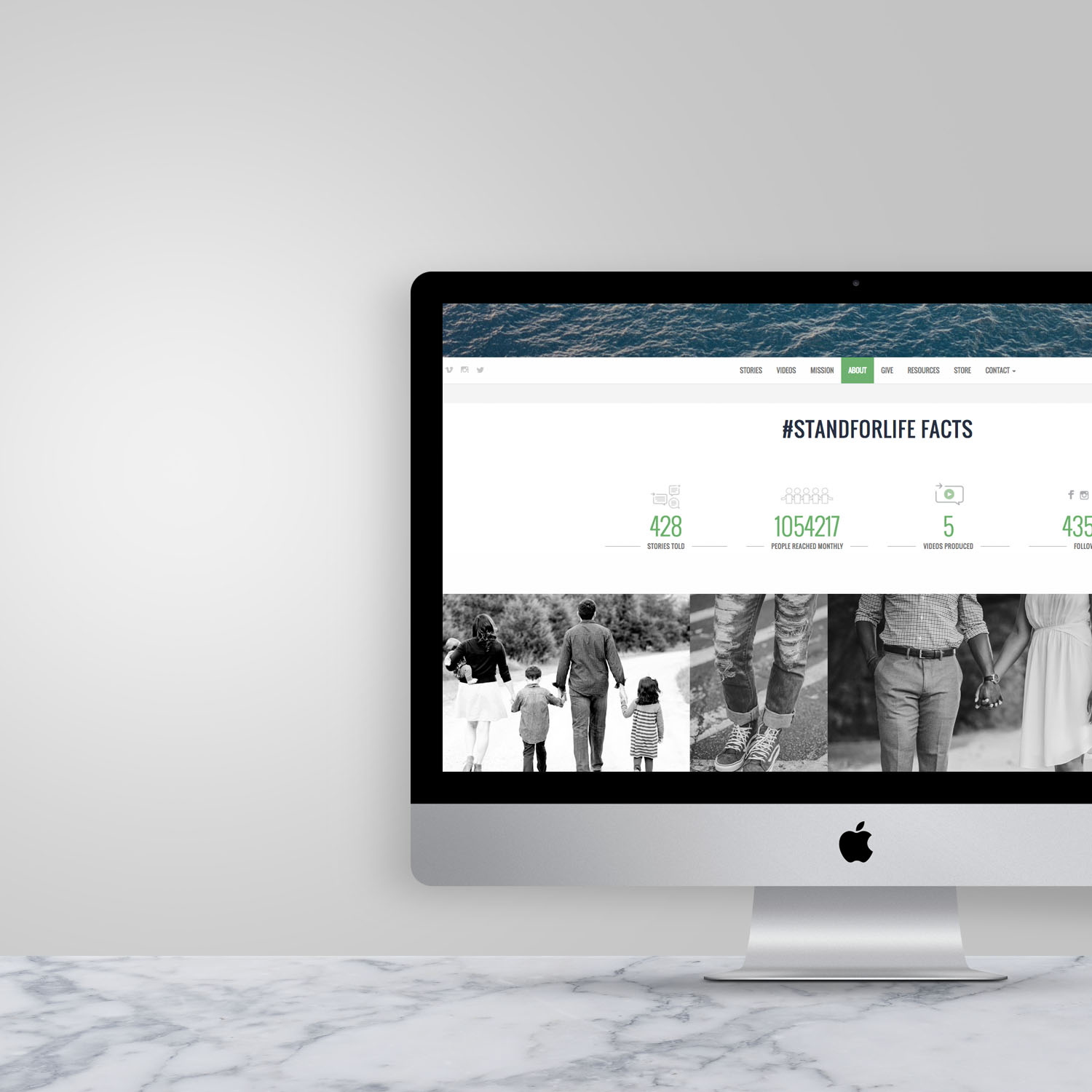
After we had a few projects under our belt, and the responses were positive, the SFL team asked if I would design their new website. Although I knew this was would be a pretty big undertaking due to the nature of creating a completely custom site, I jumped at the opportunity.
Most of the interaction between the team and their target audience happens through social media, so we wanted to create a website that highlighted and facilitated each channel effectively. The homepage features their Instagram feed and each time a visitor clicks a photo, the website generates all the stories with the same tags. Because we didn’t use a website template, we were able to completely customize the layout and content of the pages in a way that best tells the #StandForLIFE brand story and messaging.
I’ve since created more promotional materials for SFL and each time I read another story I’m convinced what these women are standing for matters. Looking back on this past year, I love how cohesive, sophisticated and approachable their marketing collateral has become. To me, what we have been able to create together in SFL's visual branding ties in the importance of the stories and value of life in a professional yet personal way.
It’s been an honor to work with such an amazing team of ladies. Check out the new #StandForLIFE website, browse their Instagram feed, and be inspired to see change happen.


