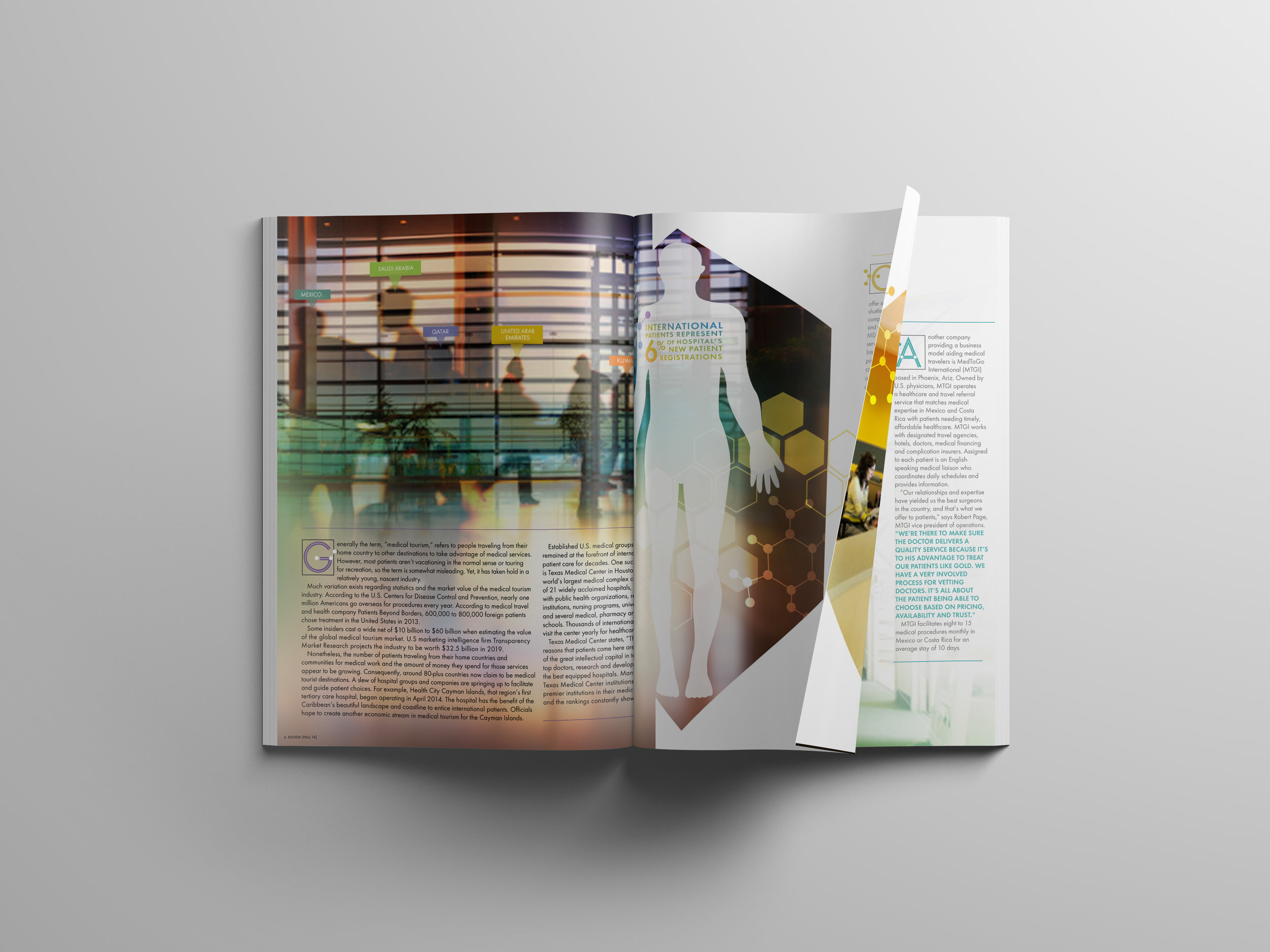
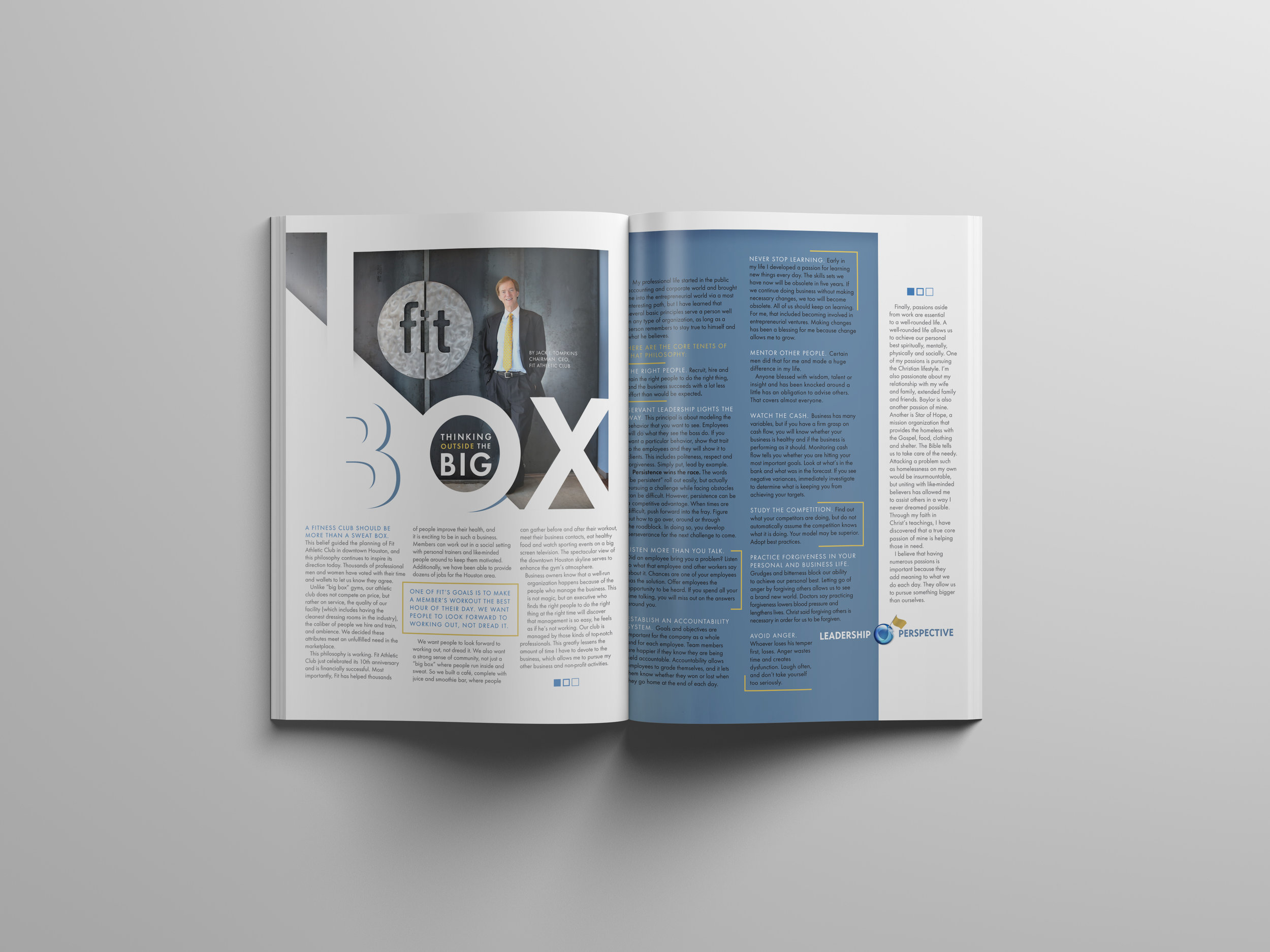
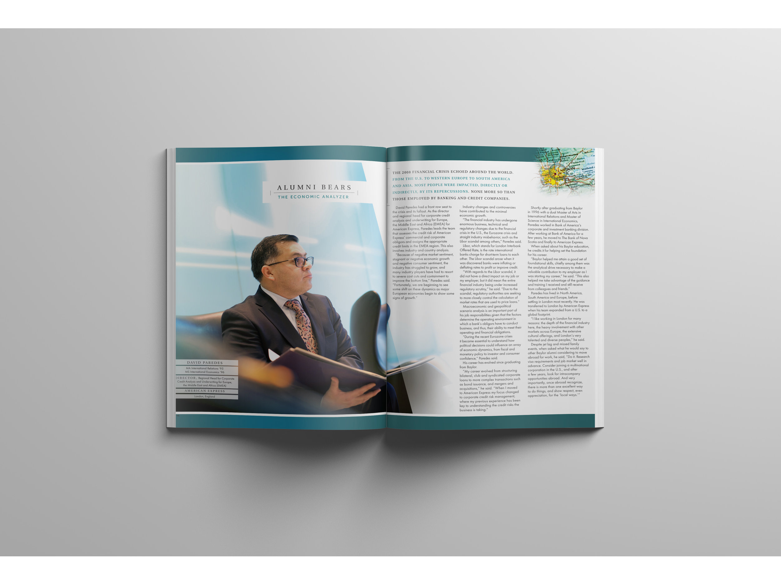
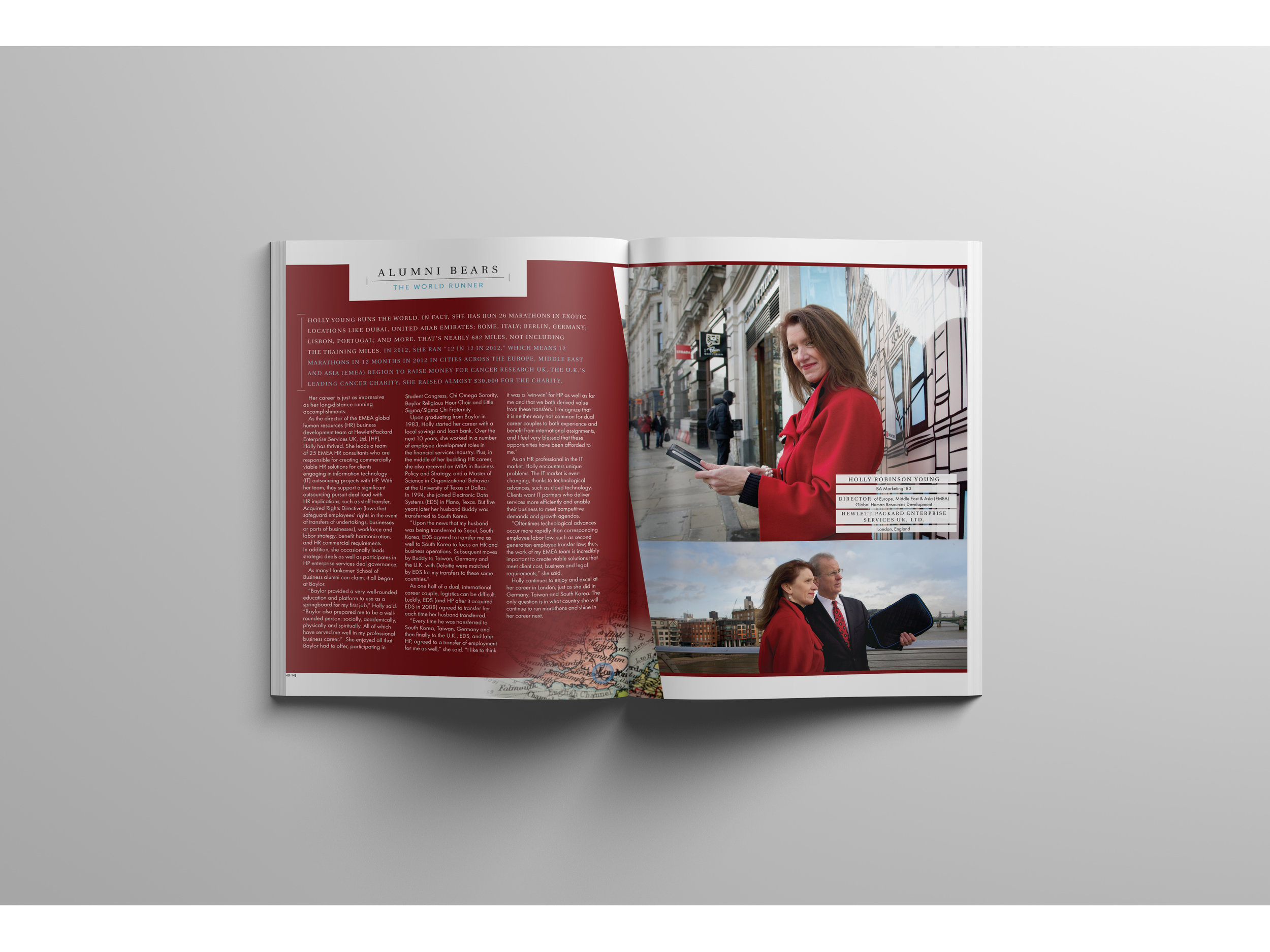
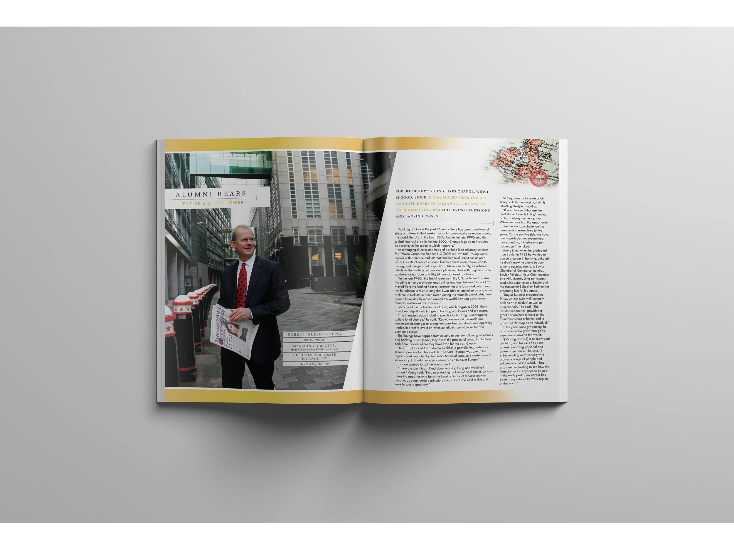
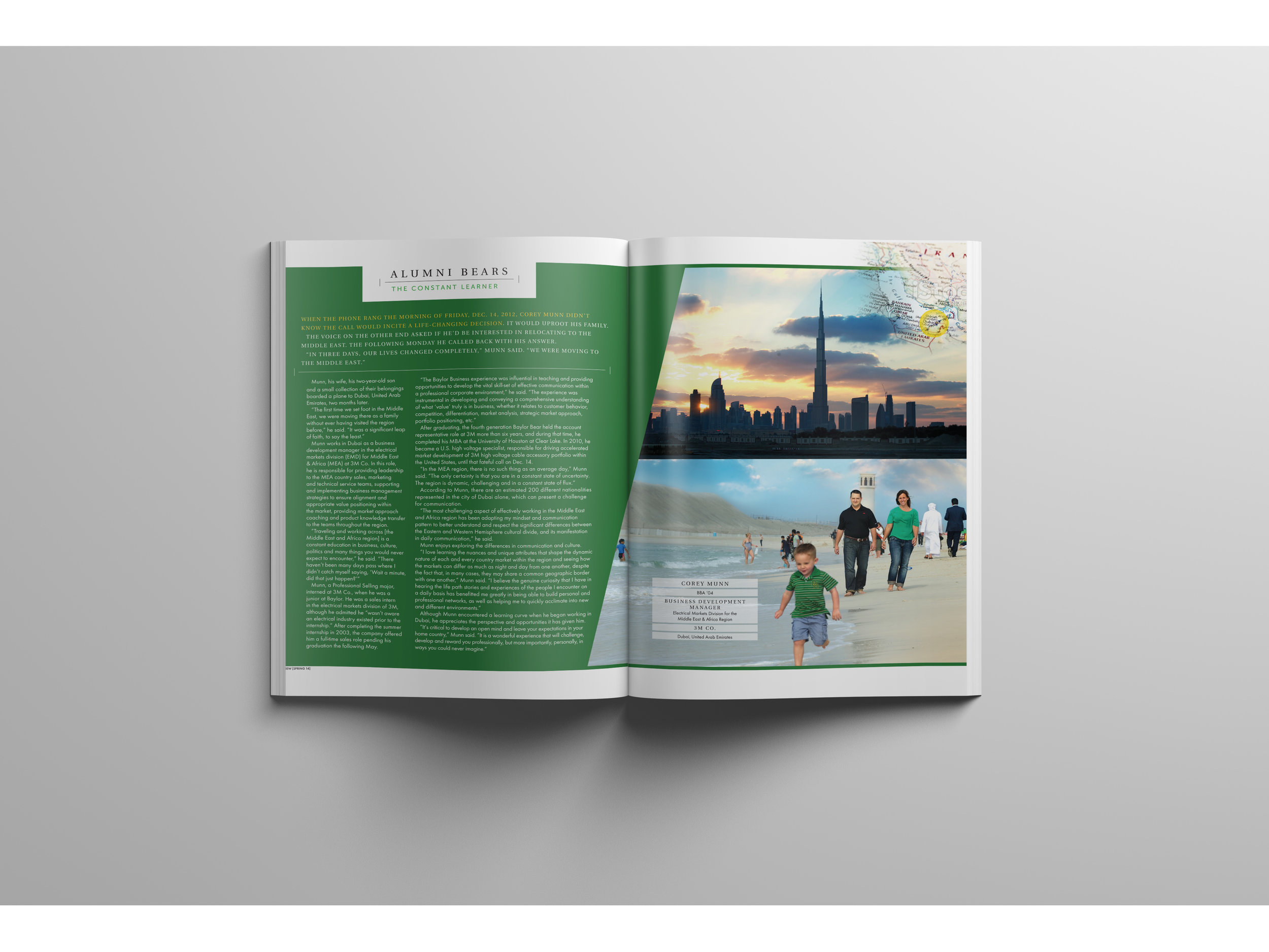
As a kid, and even now, I never have enjoyed putting together puzzles. Getting all the pieces out, organizing them into corner pieces, flat edge pieces , the pieces that look like they go on the top of the puzzle, and so on. Then you spend hours testing and trying each one to see which ones in fact fit together to make the final image. However, in my adult life and career as a graphic designer, this work is often very similar to a puzzle. As a matter a fact, publication design and layout is very much like a puzzle, and yet it is one of my favorite types of projects to work on. There are the pieces – copy, images, logos, and colors that all need to fit inside the parameters given. It's my job to come up with creative problem solving design solutions and make it all work cohesively into the final layout. This too takes hours of testing and trying the different pieces together to find out what works and what doesn't, but for me this process is energizing.
Have you ever come across an article or publication in which you were interested in the content, but visually it was disoriented and hard to read? They are out there, and my goal is always to come up with a nicely designed layout that should make you want to read the article. It should draw you in visually with the images and colors enough to give you an idea of
what you are about to read. It should be easy to read, enjoyable to look at, and cohesive in design and content.
