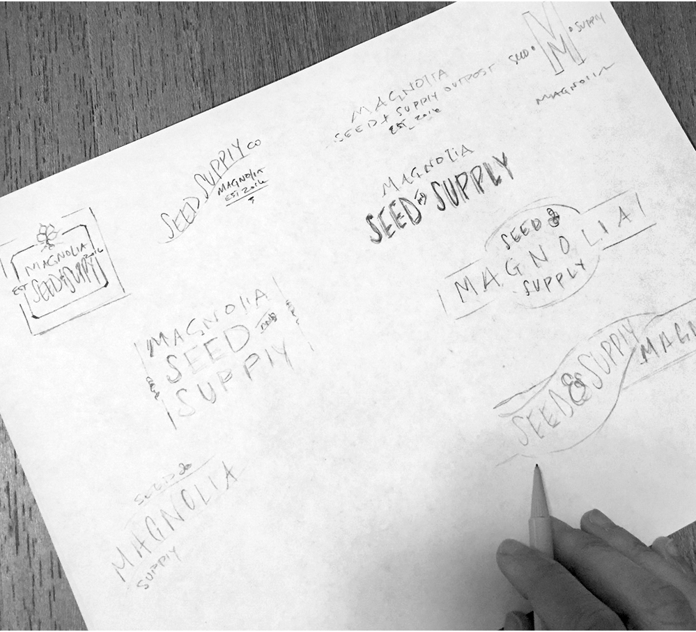
As Magnolia was developing and expanding construction for Magnolia Market, I was brought in to create the logo for Magnolia Seed + Supply, which is now housed at the back of the property at Magnolia Market at the Silos here in Waco. I was thrilled to be brought in as a creative; it was a fun to way to join the city’s excitement over revitalizing downtown, and to be a part of Magnolia’s growing brand.
Since Magnolia has a very recognizable brand and visual theme, the process of creating a new logo design needed to align with their preexisting brand style. Before I began sketching possible logos, we decided to keep the word “Magnolia” in the preexisting brand font, as at that time, the brand was really starting to become nationally recognizable. So I played with varying typography options for the “Seed + Supply” portion of the logo, knowing that the logo needed to be gender neutral, and work as a one color logo.
I don’t generally provide my clients with many variations of logos. Normally, I narrow the options down before presently. However, in this case, Magnolia wanted several options, so I sketched about a dozen. Coming up with different ways to display so few words was what they wanted to see, which is why you see so many structural variations, such as stacked options, as well as the words in several different movements.
The Magnolia team approved the logo you see now, and then it was off to Jimmy Don to create the metal store signage. This project was incredibly smooth and fun to be a part of; it has also been very gratifying to see something I designed represented and recognized nationally and internationally.


