Many parents dread “the talk” with their kids. Some dread it so much that they never breach the topic, and their kids are left to seek answers to their questions elsewhere. In 1986, Mary Flo Ridley, a mom herself, felt convicted of the need for a better and easier way to go about “the talk.” She envisioned a communal place where parents could freely discuss better techniques and new strategies to answer their kids’ questions – perhaps even before they were asked. She began presenting a popular parenting seminar in the Dallas area, teaching parents how to talk to their children about sex. In 2015, Mary Flo was ready to "retire" when a long-time family friend and fan of her program, Megan Michelson, a former middle school teacher who had personally experienced the benefit of the program, offered to come alongside and help. Mary Flo agreed, and together they decided to re-launch the company as The Birds & The Bees.
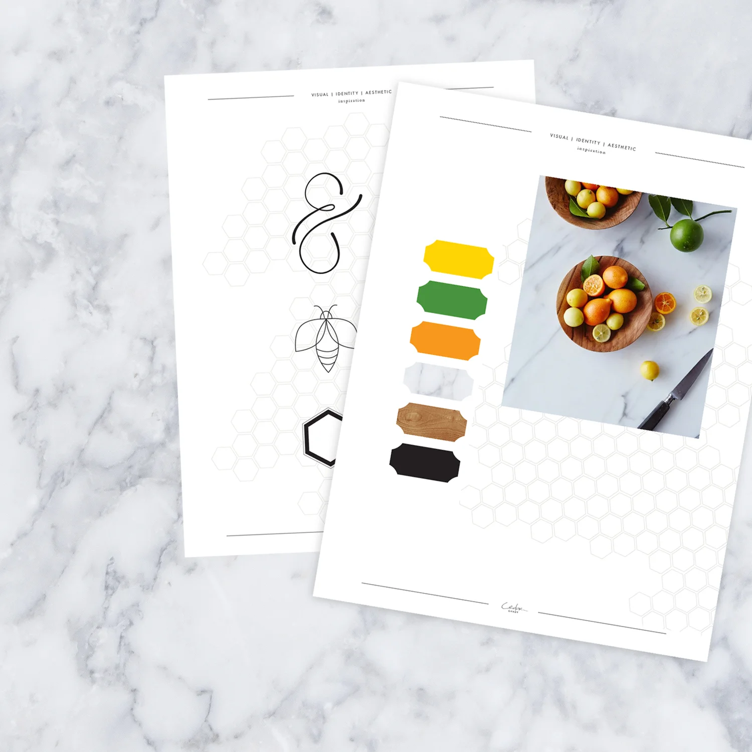
In the fall of 2015, Stand For Life, referred The Birds & The Bees to me. Mary Flo and Megan were keen to the fact that they needed to rebrand their program in order to engage with a new generation of parents. They knew that in today’s digital and fast-paced culture, their product needed to target on-the-go moms. Nowadays, moms don’t necessarily have time to go to a conference, or even read a lengthy book; but they do have a few minutes to watch video clips on their phones or quickly scroll instagram. Knowing their target audience and mode of communication, their social media presence and website were the most important in the beginning stages of the re-launch. Their main goal was one of encouragement and approachability; yes, this is a hard conversation to have, but one that you can do with the simplified material and supportive community that The Birds & The Bees offers; primarily their extremely effective 6-step strategy that walks parents from preschool to preteen. Therefore, everything we created was under the tier of, how can we make this easy and approachable for people? For the website this meant a streamlined design, simplified content, and bright colors that promoted hope and encouragement. For the logo, it meant a whimsical along with a friendly, simple, approachable, and sophisticated yet playful style. Hints the fun ampersand and simple icons.
When building something from scratch I always believe consistency is of the upmost importance, and they agreed. The image of the brand suffers if there’s no consistency across a company’s various platforms. So, consistency throughout all the pieces – including digital workbooks, pamphlets, and website design was very imperative. Consistency puts value, quality and trustworthiness in the forefront for your audience.
The first step toward consistency was color choice. The clients really wanted refreshing colors that would pop. They were inspired by and drawn to a bowl of fruit, filled with lemons and limes. To them, these colors represented bright, happy nature and a fresh color palette. The company itself serves to promote growth and restore a nurturing posture, and they wanted their visual branding to reflect that.
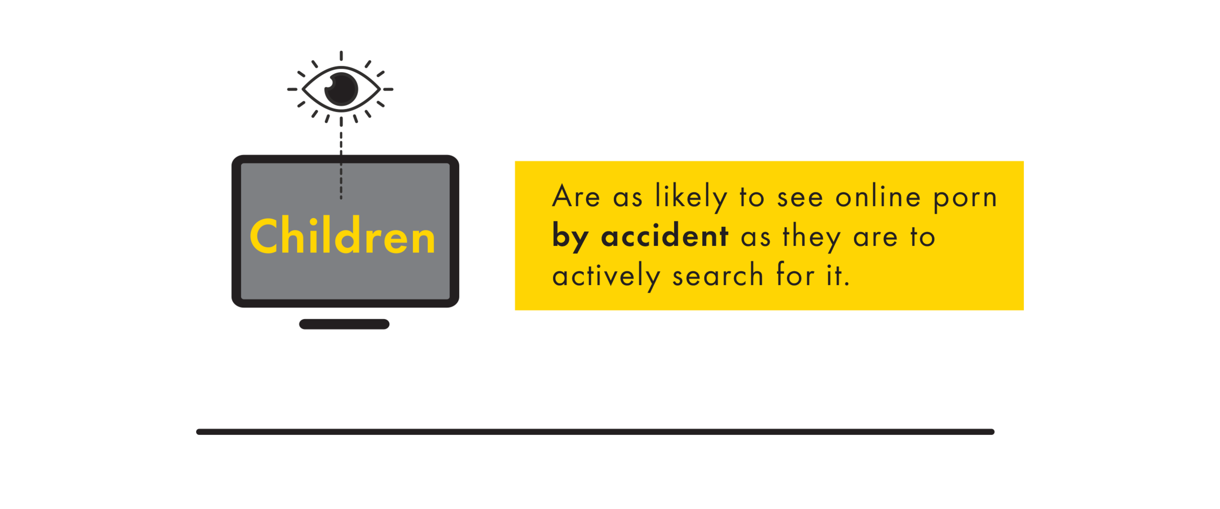
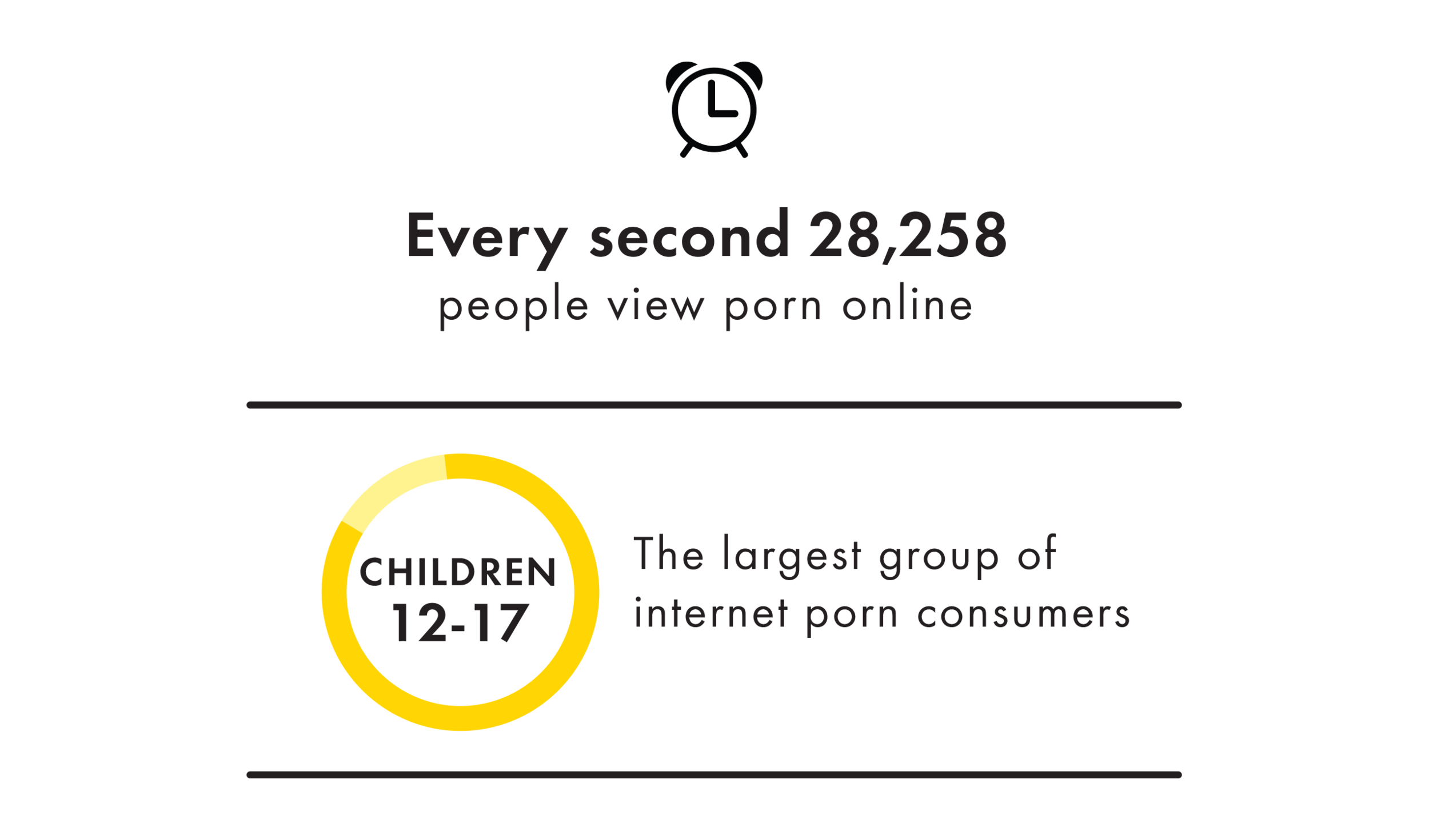
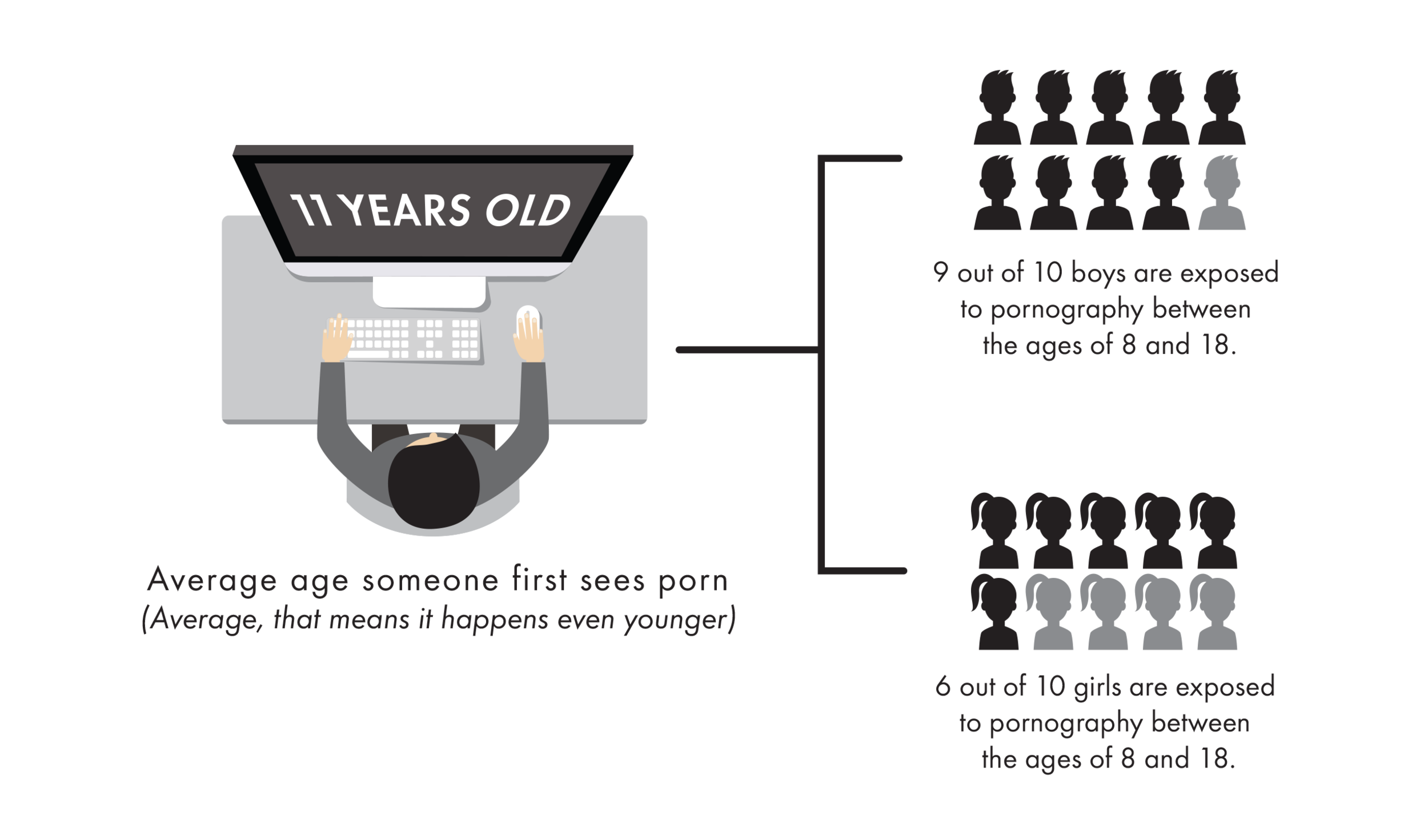
In addition to a consistent color palette was creating a cohesive website, as the clients’ goal was to reach mothers and families online. My primary motivator was making sure their message looked light, fresh, airy, approachable and interactive. On the website, there is a page about why this program is so crucial; why finding a better way to talk to your children about sex and reproduction is important. It includes statistics about heavy and disturbing issues, so in an effort to mitigate the heaviness of it, but not lose its importance, I created graphics that the audience could read and be engaged without being completely overwhelmed by its gravity.
Another visual element I enjoyed creating was the honeycomb pattern which is a fun design, light hearted element, but also visually meaningful. Like beehives, it is meant to represent the joining of parents and communities who are building something together for a common purpose.
With this project, I felt compelled to really get behind their content and their message. I recognized the importance of a program like this, so it wasn’t just another job to me. I wanted to help get this message out and I wanted it to be straightforward, clear and simple to articulate and to understand. I believe it’s applicable to men and women, no matter where you live or how old your kiddos might be.
It was a pleasure to be a part of the re-launch from the beginning, and to be able to really direct the brand visually is the ideal job!


