Let’s play a game. I’ll tell you the name of a business I worked with and you try to guess what it does. Okay, here’s the name: Drink.
Any guesses?
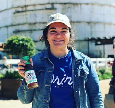
If you guessed the business offers refreshing drinks to hot and thirsty customers at the Magnolia Silos, then you’re right! Simple, right? The business is called Drink, and it sells drinks. That seems easy enough for a graphic designer. All I have to do is come up with a simple design that stands out and gets noticed; no problem!
...well maybe not so fast.
One thing I’ve learned over the years is that most often, designing something "simple" is anything but.
The concept for Drink is smart. My client owns several food-related businesses, including one that sells food at the Magnolia Silos. After feeding Fixer Upper fans for a few months, she noticed that there wasn’t a great spot for customers to just get something to drink. So, she decided to open up a beverage stand. Now, Drink offers sodas, tea, and sparkling water to thirsty Magnolia Market shoppers and locals alike.
When we started talking about the logo design, we knew we needed the final design to stand out and be easy to read. We imagined ourselves standing at the entrance to the Magnolia Silos on a hot day, looking out over the crowds toward the food trucks and just wanting something cold to drink. We wanted the logo to quickly covey exactly what the stand sells. That was the starting place from which I would refine my ideas down to the simplest form.
I’m drawn to things that catch my eye quickly—striking simplicity. That’s what we wanted for this project. In today’s world, our attention spans can be so small. You don’t want to waste people’s time with a cluttered messaging or be confusing. You want to clearly show how you can solve someone’s problem and do it before you lose a potential customer’s attention.
I found a font that I liked and started there. But, I don’t like to just buy a font and put it out to the world as a logo. I like to add my own touch to it, and it’s important to me that I customize it to fit my client’s personality. For this design, I wanted to visually represent hydration and refreshment.
I adjusted the curves of the font to give the work some movement and flow. And I customized the dot of the “i,” changing it to play on a water drop.
Once I had the typography done, I moved on to colors. Color theory and color logic has a huge role in all good, intentional design. The color wheel can be sectioned in many different ways (complementary, triad, monochromatic, analogous, etc.) and into cooler and warmer colors. Blues, greens, and purples are on the cooler side of the cooler wheel, and reds, yellows, and oranges are on the warmer side. In the scope of this project—marketing to the consumer from the food and beverage side of things—warmer colors are often associated with action and urgency, that’s why you’ll see a lot of fast food logos done in warm colors. These colors convey, “Come get it! You need it now!” Whereas cooler colors are used to convey the ideas of refreshment, relaxation, restoration and healing, and a slower pace to take time to enjoy. When you’re choosing your color palette, it’s important to know how colors affect people. Here is a good resource for more insight on that.
For Drink, I wanted to choose from the cool colors, because I wanted customers to know that coming to the Drink stand would offer refreshment and relief (quench your thirst) in from the Texas sun.
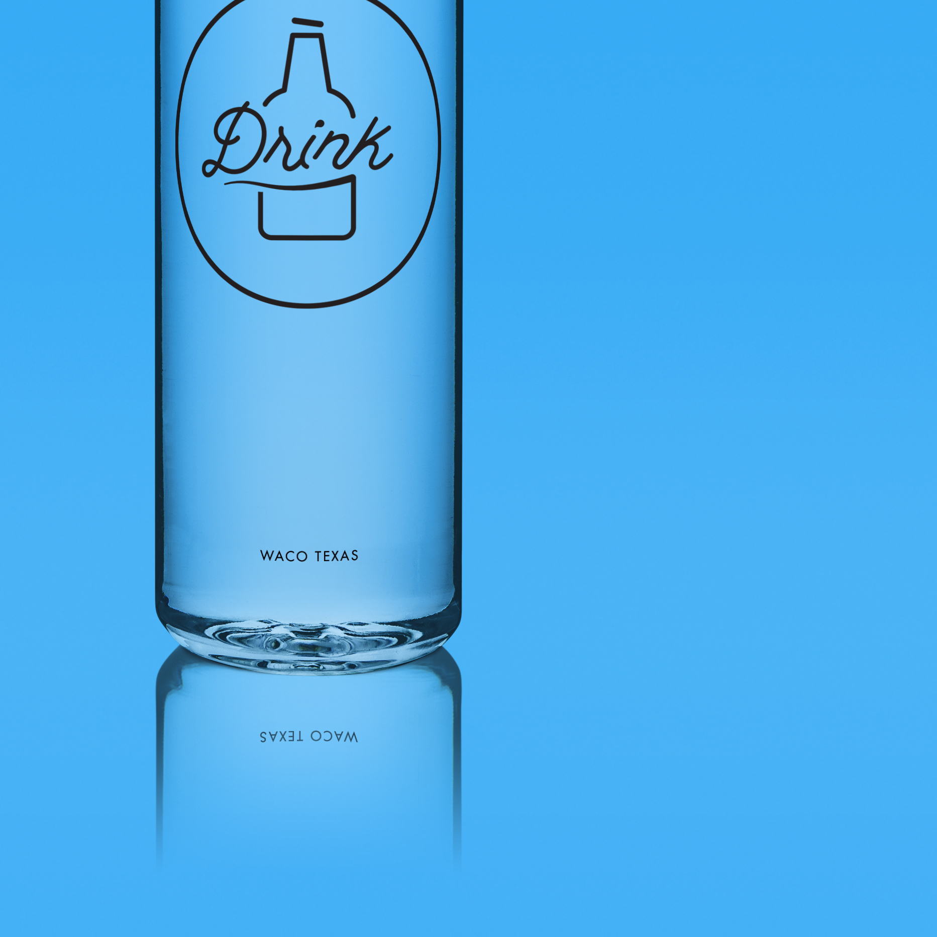
Any time I design logos, I create them in one color first, because if it can work in one color, it can work when other colors are added. I chose blue from the cool side of the wheel and because blue instantly makes people think about water. Also, I went with a deep shade of blue to make sure that the white design would stand out when used reversed.
And with that, the Drink logo was created. I often say that although the end result looks simple, the process to get to "simple" is often double or triple the work. One of my favorite podcasters SeanWes has a joke, "How much is simple?...Triple."
I kept it "simple" by customizing the chosen font which added movement and fluidity to capture the personality of this brand for my client. Drink is based on a simple concept: people are thirsty and we provide them something to drink. But its simplicity provided a great design challenge that I am always up for. With time and intentionality I created a logo that captures the essence of Drink’s product, an eye catching problem solver for thirsty customers.


