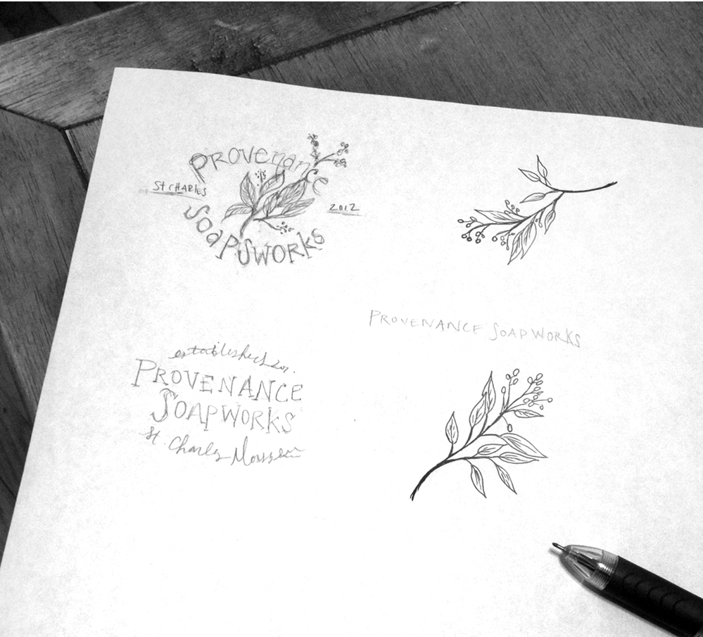
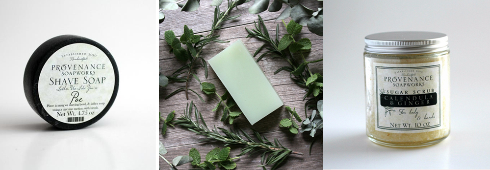
This beautiful project came to me all the way from the historic district of St. Charles, Missouri! The owners of this endearing soap shop were in need for new branding that could visually communicate their handcrafted bushiness. Through my process of getting to know each client and their specific needs and desires I was able to nail down a few "aesthetic themes" as a starting place. "Modern apothecary", "natural ingredients", "classic", "elegant" and "clean", were all important descriptions that needed to be represented in this logo. My client also wanted to incorporate foliage of some kind into their visual branding, so I sketched out a few leaves and branches to help associate the "natural ingredients" part of their products. As I started sketching I realized I wanted the foliage piece to be neutral, not too fall, winter, or spring. It was important to create a logo that could easily brand their business, their regular product line, and their seasonal line without going over board one way or the other.
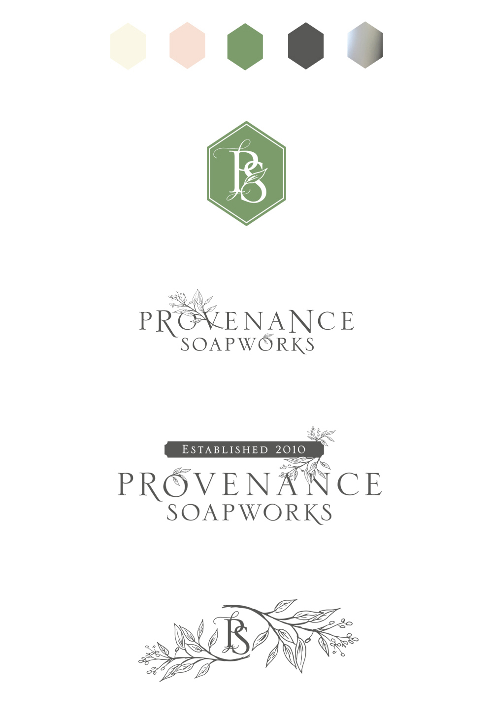
I love when clients want and understand the value of additional branding elements to go along side their logo. In this case PS (short for Provenance Soapworks) is an element they use quite often on their products and throughout their store. I came up with two different designs for the PS, one simple almost like a mark or seal that they could actually stamp into their products, and the other more whimsical and elegant.
I look forward to seeing the many new and classic products Provenance Soapworks will roll out over the coming years, knowing they have a branding that will withstand the test of time.


