Of course, at the end of the day the goal of this project was to help Stephanie get elected and grab a seat on the Waco ISD school board. (Which she did. Yay!) I played the role of creating some great eye-catching and consistent marketing material for her campaign.
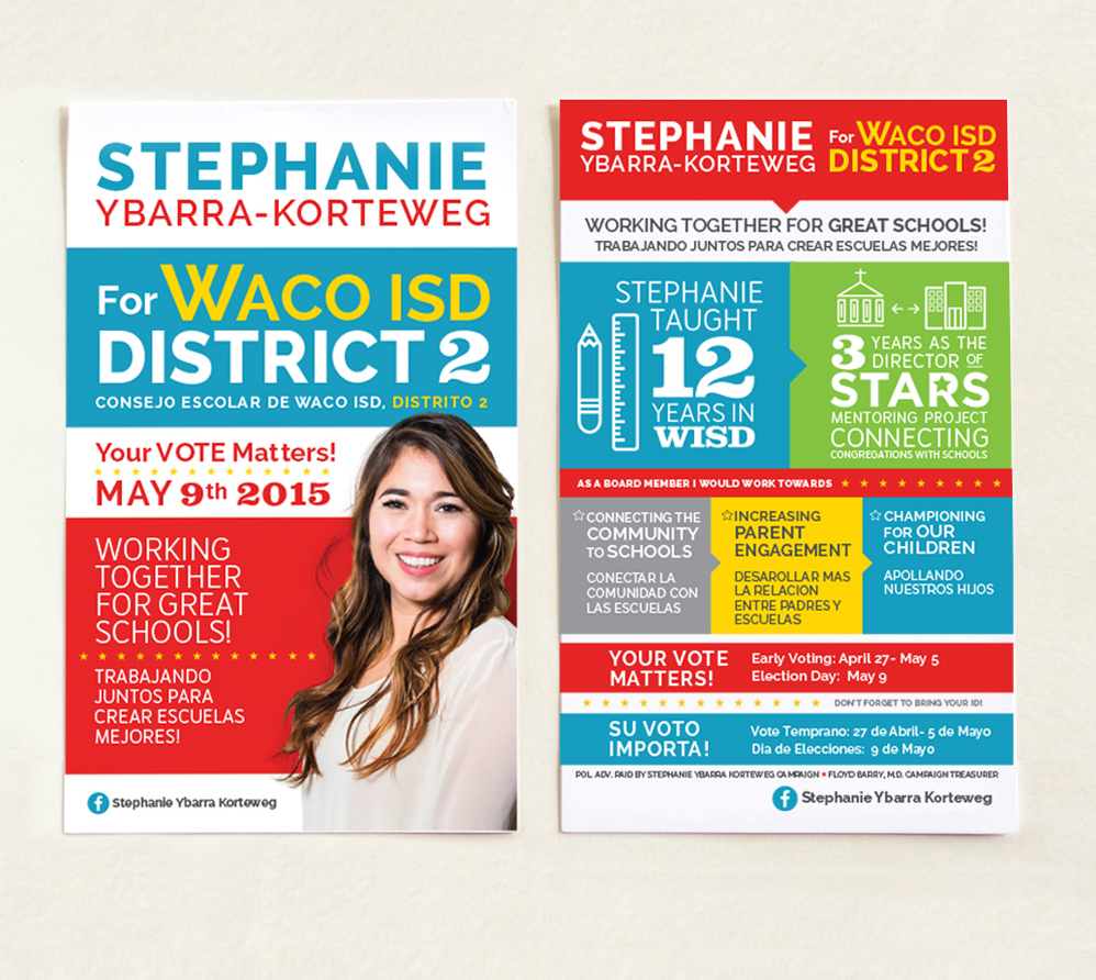
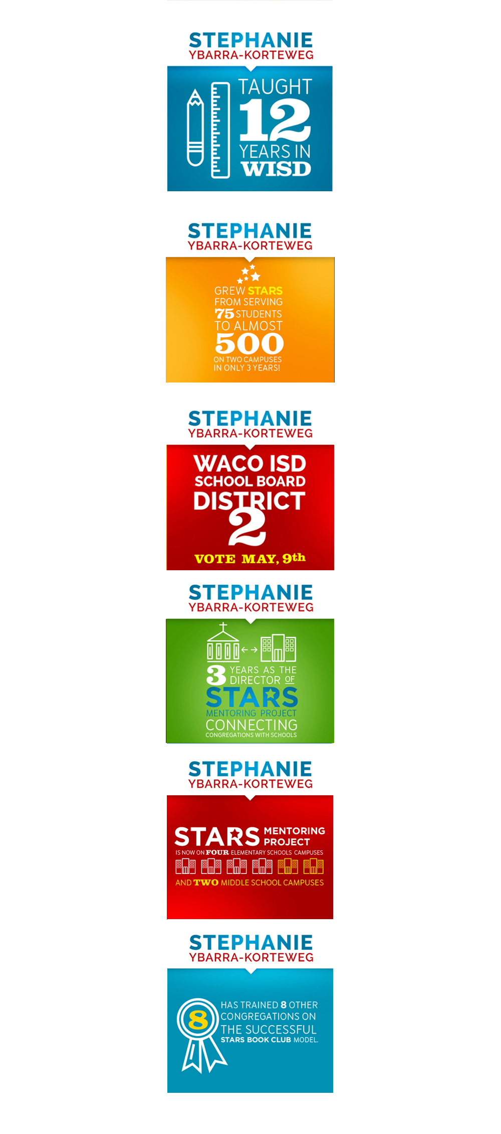
From the beginning it was important that whatever she put out for the public to see needed to be noticed, relatable, and memorable. I wanted it to have a different look and feel from the typical red and blue political campaign, but not go too far out there. The first idea I came up with was to communicate her "resume" to the public using simple graphics and attractive colors so that her target audience would be visually interested and engaged. Everything I created needed to be attractive to both students in the school district, teenagers, parents and teachers. It was important that no matter who came across Stephanie's campaign material, they could relate to it in some way.
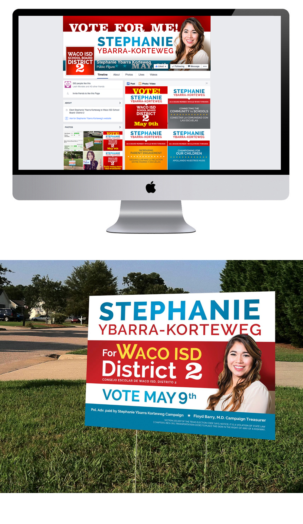
I thought it was important to have her picture and first name on everything from yard signs to direct mailers to her social media content. The reason being was in most political campaigns, the candidates are referred to by their last name, which is usually the most prominent focus, and doesn't naturally create a sense of "knowing the person". I decided to go a different direction with the vision being personal, approachable, memorable, and friendly. Therefore, we used Stephanie's first name and photo as the more prominent focus of this campaign, with the hope that it would draw people in and create more "personal, memorable" interaction. My motivation behind it was, when it came time for the public to vote (whether they knew Stephanie or not) they would be more inclined to vote for "Stephanie" – the friendly, approachable, contributor to the community that they had become acquainted with through her campaign material.


