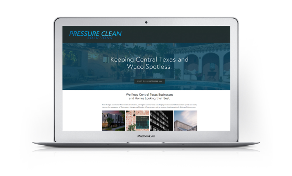
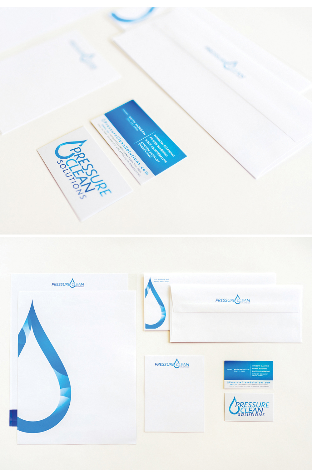
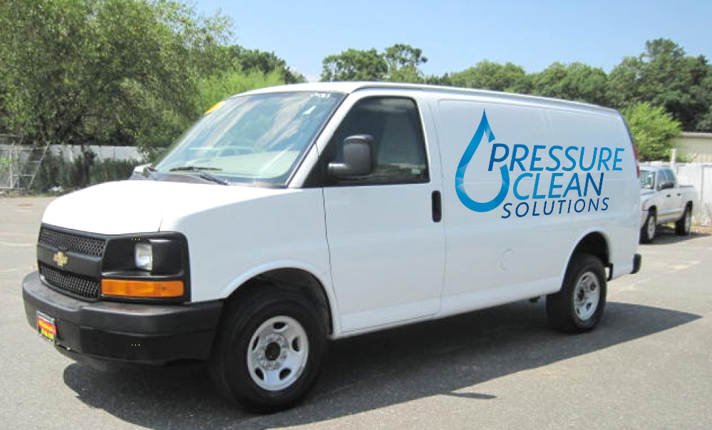
Clean, uncomplicated, and straight forward — that is the message I wanted to communicate through this re-brand. The logo needed to be easy to read and bold, the colors needed to be updated as well as inviting, and the over all message behind the business needed to be clear. This is a family owned and operated business, so it was important to me to design something that conveyed being approachable, but didn't compromise the level of professionalism and experience that the business does operate in.
My favorite part about the re-brand is the water drop. I wanted to give them a strong element in their visual branding that maybe one day in the future could stand on its own.
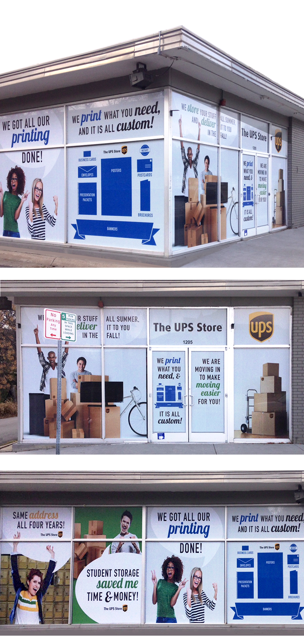
The local UPS Store Wraps it up!
This was an interesting project because I was working with one of the most recognizable brands in the world. Everyone knows that UPS does shipping, but when the time came to re-wrap their box truck, and create window wraps for their new store, the owners of the UPS Store (one happens to be my husband so how could I say no to this one!) came to me and asked "How do we convey that we do printing, mailboxes, and more?"
We worked through several different options. Lots of sketches, brainstorms, discussions, etc. Then we realized an old design secret might hold true in this case---sometimes less is more.
A pet peeve of mine are billboards and signs designed in such a way that you cannot actually read them when you are driving down the road. So for this project, we went for something simple, big, bold, and easy to read. What we came up with communicates the message loud and clear, and you can see it when you're driving by at 60 mph.
Check it out for yourself--next time you need printing done head by one of the Waco UPS Stores!